STRATEGIC HUES
The power of colour trends for a modern brand
Adopting current colour trends for your brandable clothing isn’t just about aesthetics – it’s a strategic move that speaks volumes about your brand’s relevance and adaptability. Staying attuned to colour trends ensures that your team presents a modern and cohesive image, resonating with contemporary sensibilities. It communicates that your brand is not just part of the current conversation but is leading it.
Aligning with popular colour choices can create a memorable visual identity, fostering a sense of unity and professionalism. By incorporating trending colours into your brand uniform, you not only enhance your visual appeal but also demonstrate a commitment to staying dynamic and in sync with evolving market preferences
PALE BLUES
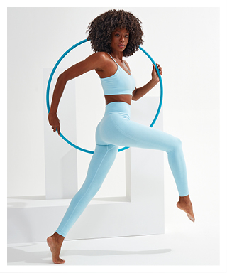
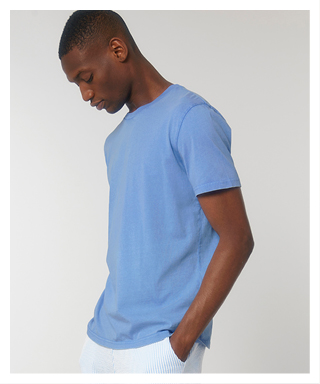
The 2024 fashion scene is set to sparkle with a spectrum of blues; but according to Who What Wear, it’s the delicate hue of pale blue that’s poised to take the spotlight during this spring and summer. Universally flattering, this colour transcends boundaries,
complementing every skin tone and hair colour with effortless grace. Pale blue isn’t just a fashion statement; it’s a powerful tool in branding, sending subtle yet impactful messages:
Tranquillity and serenity: perfect for spas and care industries, pale blue exudes a sense of calmness and peace, inviting clients to unwind and relax in a serene environment.
Freshness and cleanliness: ideal for cleaning services and casualwear, pale blue signifies freshness and cleanliness, creating an aura of purity and hygiene that resonates with clients and customers alike.
Youthfulness and playfulness: with its whimsical charm, pale blue appeals to a younger demographic, infusing children’s clothing and accessories with a playful energy that’s both carefree and delightful.
Coolness and refreshment: as a cool-toned hue, pale blue offers a refreshing escape from the heat of summer. Whether adorning lightweight tops, flowing skirts or beachwear, it brings a breezy and invigorating vibe to summer fashion, revitalising the senses, every time.

REDS
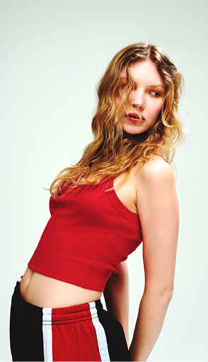
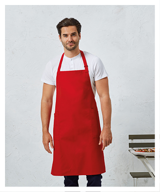
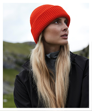
While pink may have dominated the color palette over the past year, 2024 suggests a noticeable shift towards vibrant red tones. Red is a dynamic and attention- grabbing colour that evokes a range of emotions and associations.
Retail and sales: red is commonly used in retail branding to attract customers’ attention and stimulate purchase behaviour. It’s often employed in sale signs, promotions and packaging to convey discounts, urgency and excitement.
Food and beverage: red is frequently utilised in food and beverage branding to
evoke feelings of appetite and indulgence. It’s associated with bold flavours, energy and vitality, making it a popular choice for restaurants, fast-food chains and beverage companies.
Technology and innovation: red is often used in technology branding to convey innovation, dynamism and forward thinking. It can represent cutting-edge products, high-performance capabilities and a competitive spirit, appealing to tech-savvy consumers.
Healthcare and beauty: in healthcare and beauty industries, red is employed to signify vitality, passion and confidence. It can be used in branding for cosmetics, wellness products and healthcare services to evoke a sense of wellbeing and empowerment

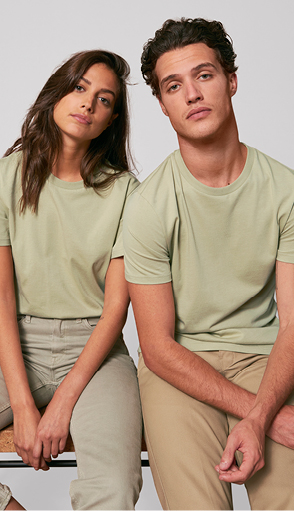
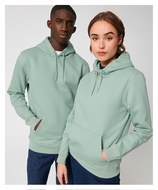
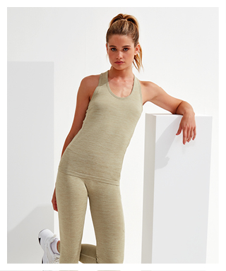
This year, anticipate a shift towards a softer rendition of the verdant tones that dominated 2023. Whether you prefer to label it as sage, pistachio, laurel, celadon or simply light green, the choice is yours. What truly counts is embracing this hue in your wardrobe and making it your own. Light greens evoke a sense of freshness, growth and renewal; and, in branding, they can convey various meanings and associations.
Health and wellness: light green is associated with health, wellness and tranquillity. Brands in the wellness industry, such as spas and organic skincare lines, can use it to promote balance and rejuvenation for consumers seeking holistic wellbeing.
Youthfulness and innovation: light green signifies youthfulness and innovation – ideal for brands targeting younger demographics or those in tech and education sectors. It symbolises progress and creativity, appealing to forward-thinking consumers.
Freshness and quality: light green represents freshness and quality, especially in food and beverage industries. Brands offering natural and locally-sourced products can use it to evoke images of pure ingredients and high-quality goods.
Tranquility and balance: light green evokes tranquillity and balance – perfect for hospitality brands such as hotels and wellness retreats. It creates a serene atmosphere, inviting guests to unwind and escape the stresses of daily life.


 - English
 - Deutsch
 - Français
 - Nederlands

